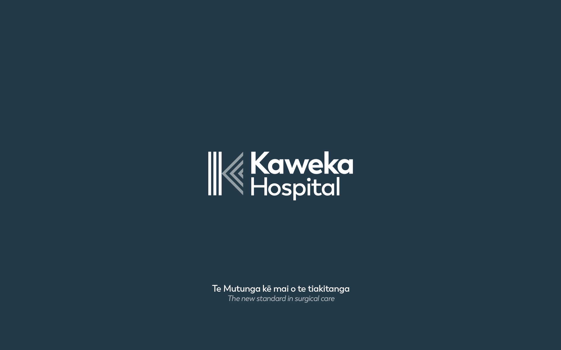
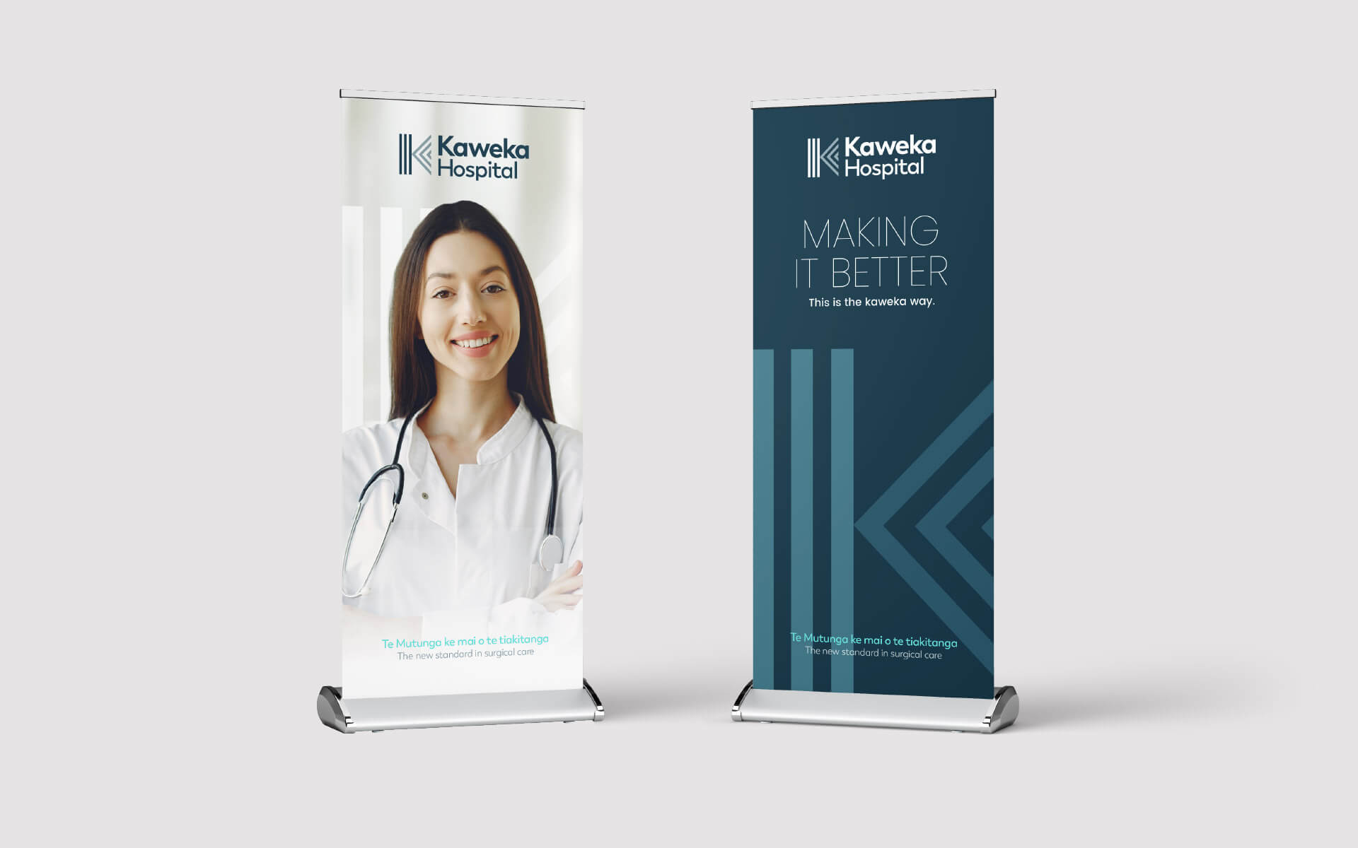
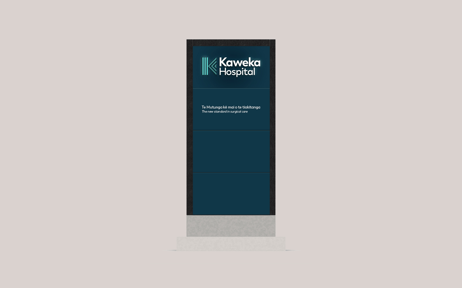
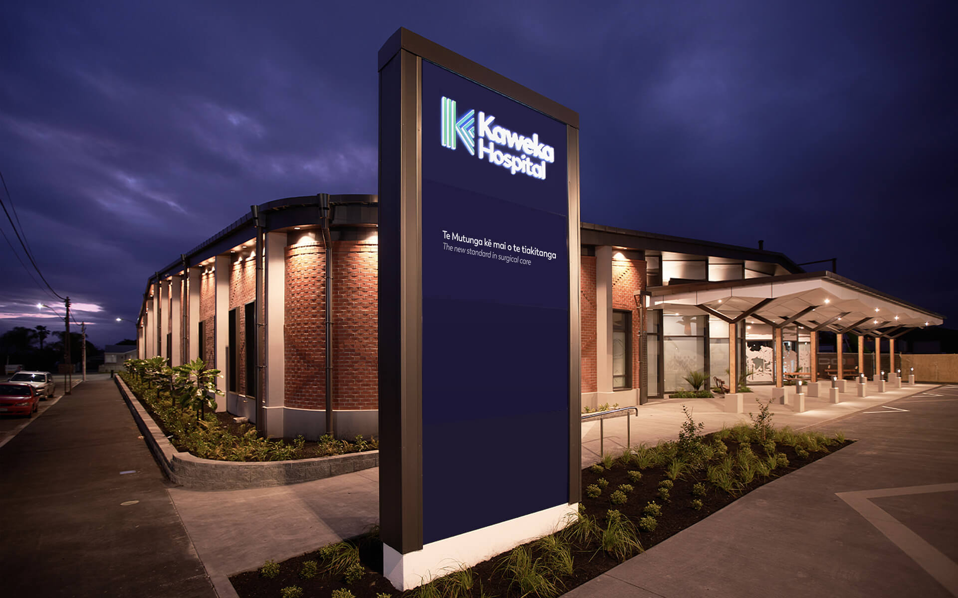
Kaweka Hospital is a new state-of-the-art hospital facility in Hastings. They required a brand that would encapsulate both the hospital, the area in which it is located and the strong Māori connection.
- Art direction
- Brand design
- Presentation visuals
- Website design
- In association with Many Hats

Details
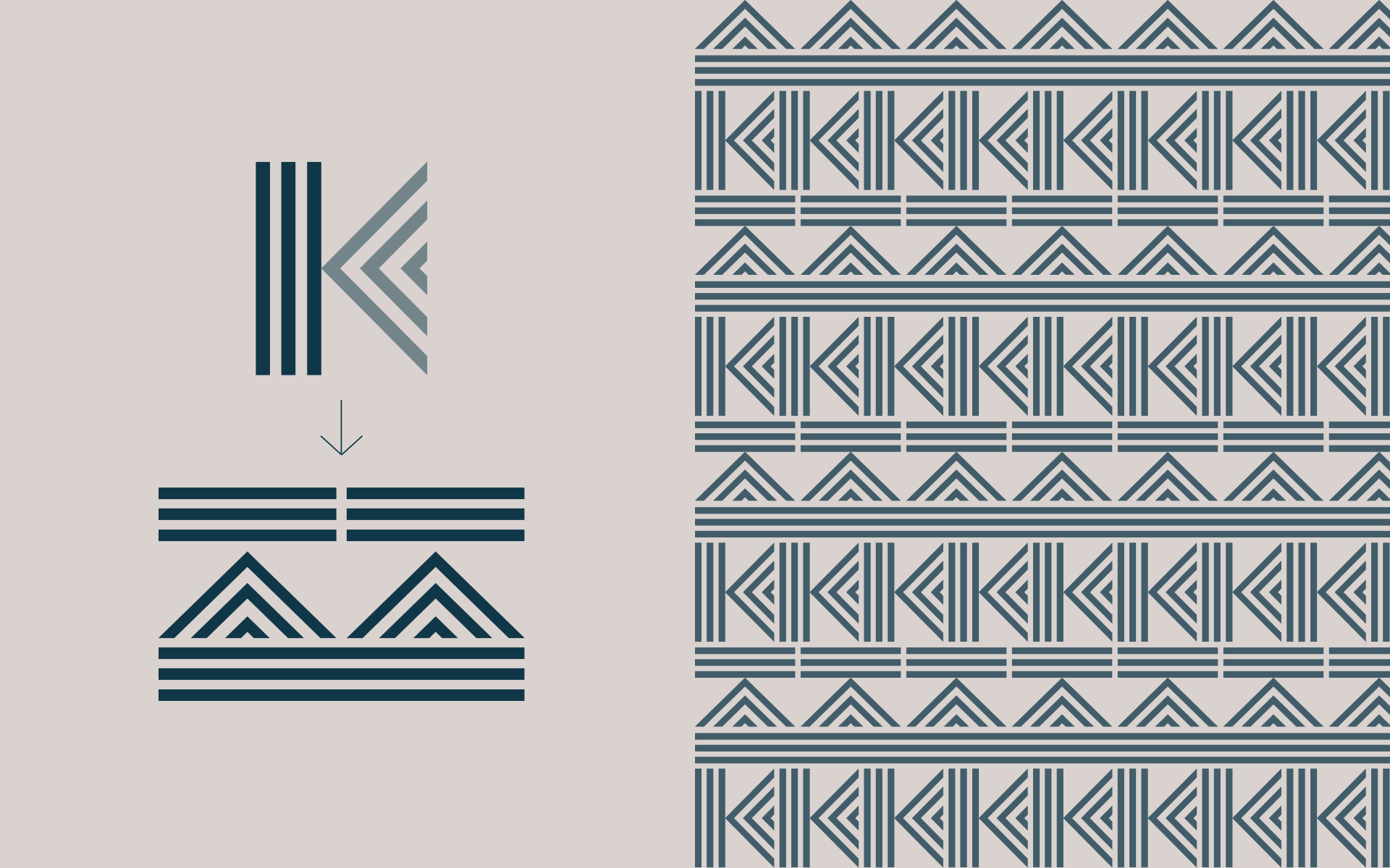
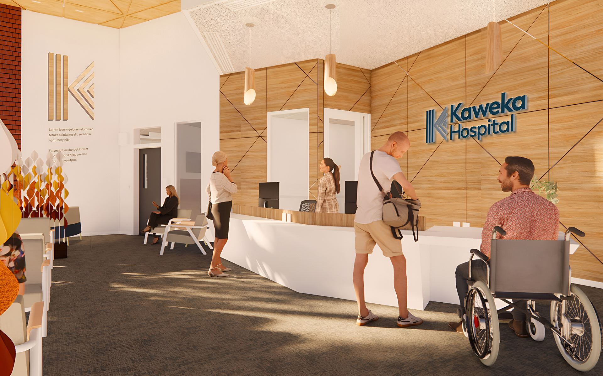
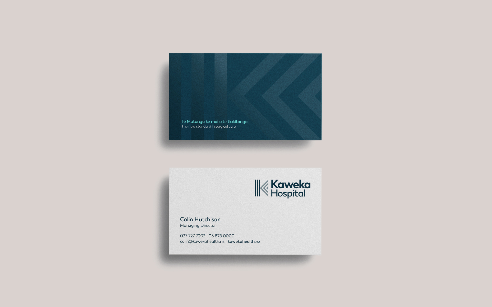
The stylized ‘K’ of the brand mark is representative of the people, the land and the region). The symbol of tuakana-teina, which refers to the relationship between an older person (tuakana) and a younger person (teina), drawn from Te Ao Māori – the Māori world. The Kaweka Ranges has three main awa (rivers) Tūtaekurī, Mōhaka, and Ngaruroro.
Therefore this logo also represents the three awa (rivers) flowing past the maunga of Kaweka. The maunga represents the whare (the hospital), and the three lines represent our people (Kaweka Staff and board), our Shareholders and partners and our community, he tangata, the people.


Brand extension
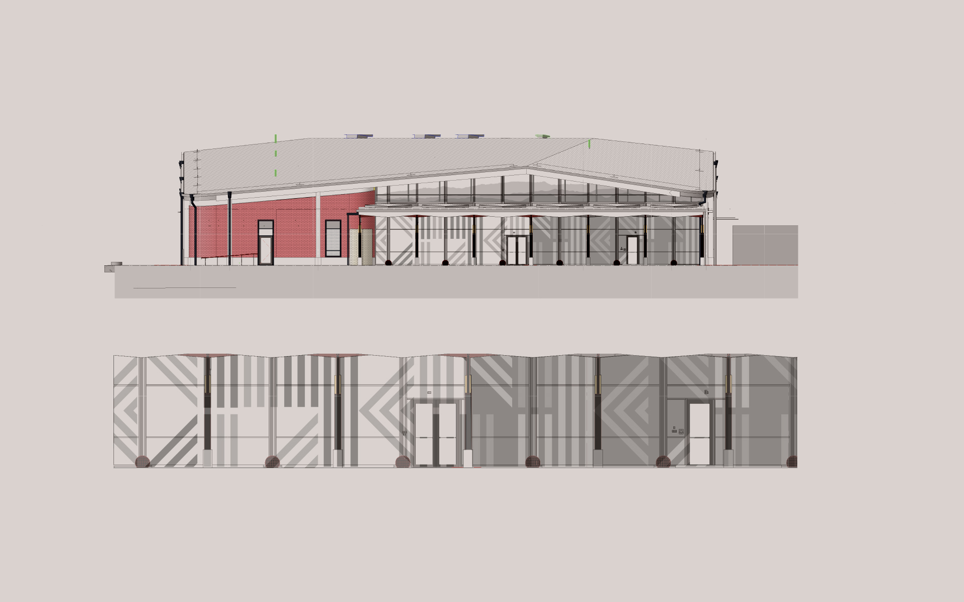
When the 'K' brandmark is turned on its side it forms the 3 geographical aspects of the brand - 1. Sky, air and clouds 2. The Kaweka Mountain Range 3. The 3 rivers running past the maunga of Kaweka. This can also extend the design to form a repeating pattern which has been designed to be applied to hospital windows and for potential use internally.