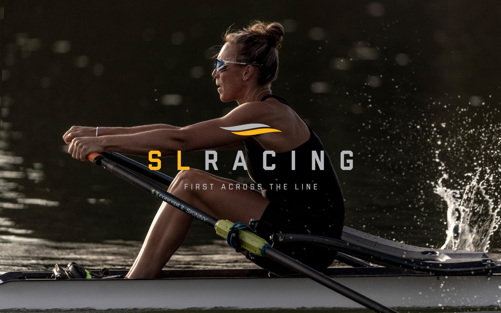
SL Racing
Face-lift for a company producing competition-grade rowing boats.
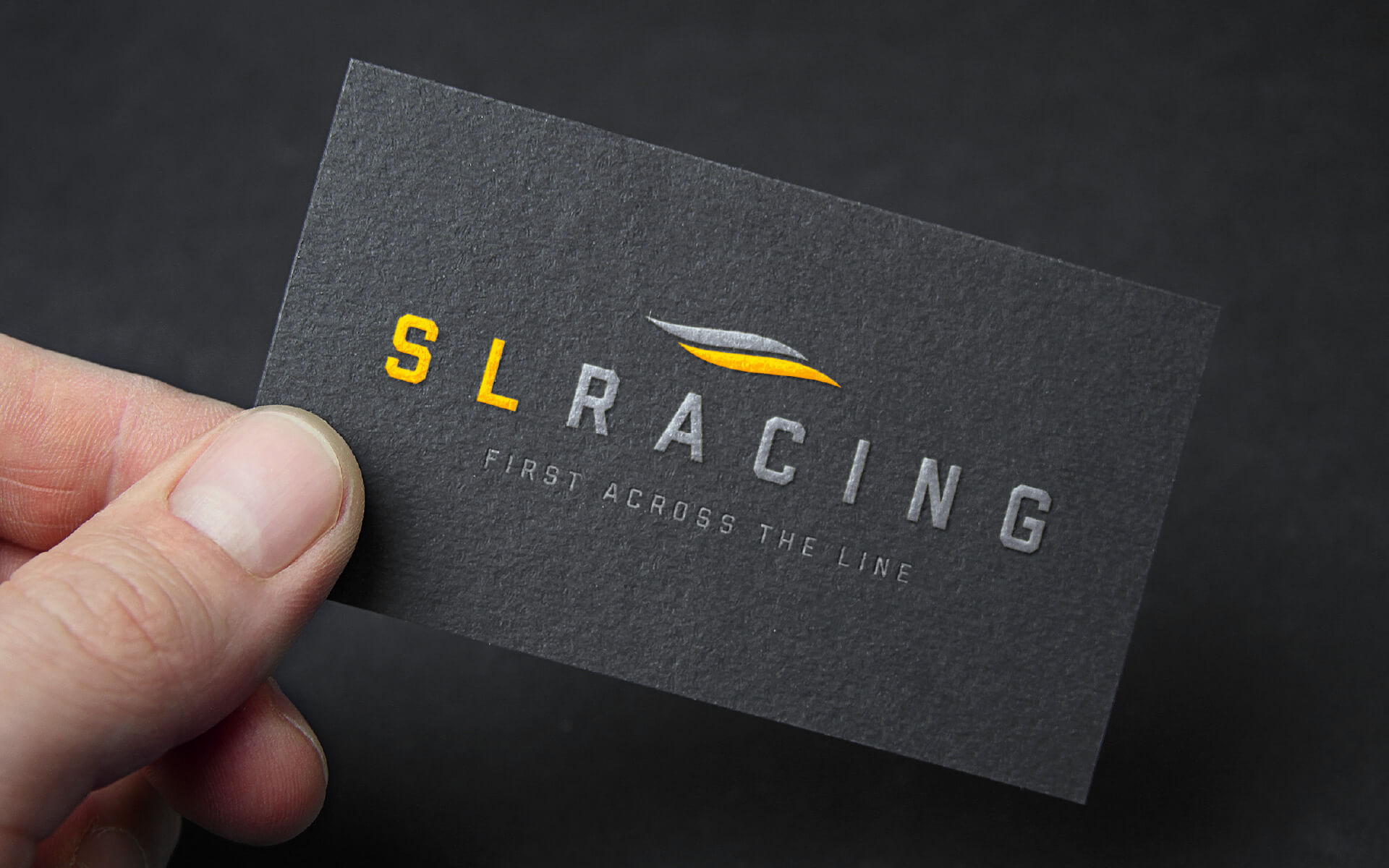
Rebrand
Logotype + design
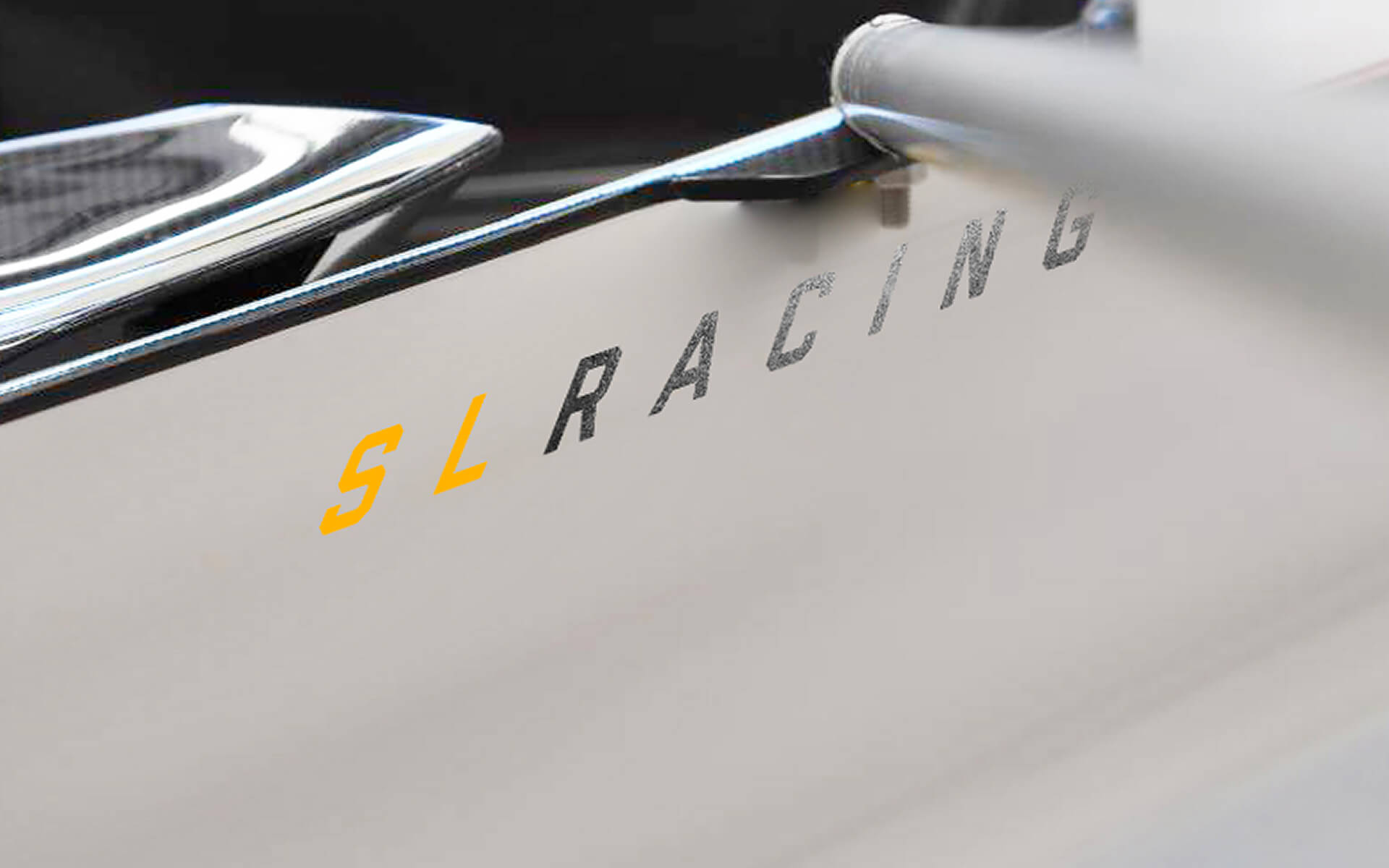
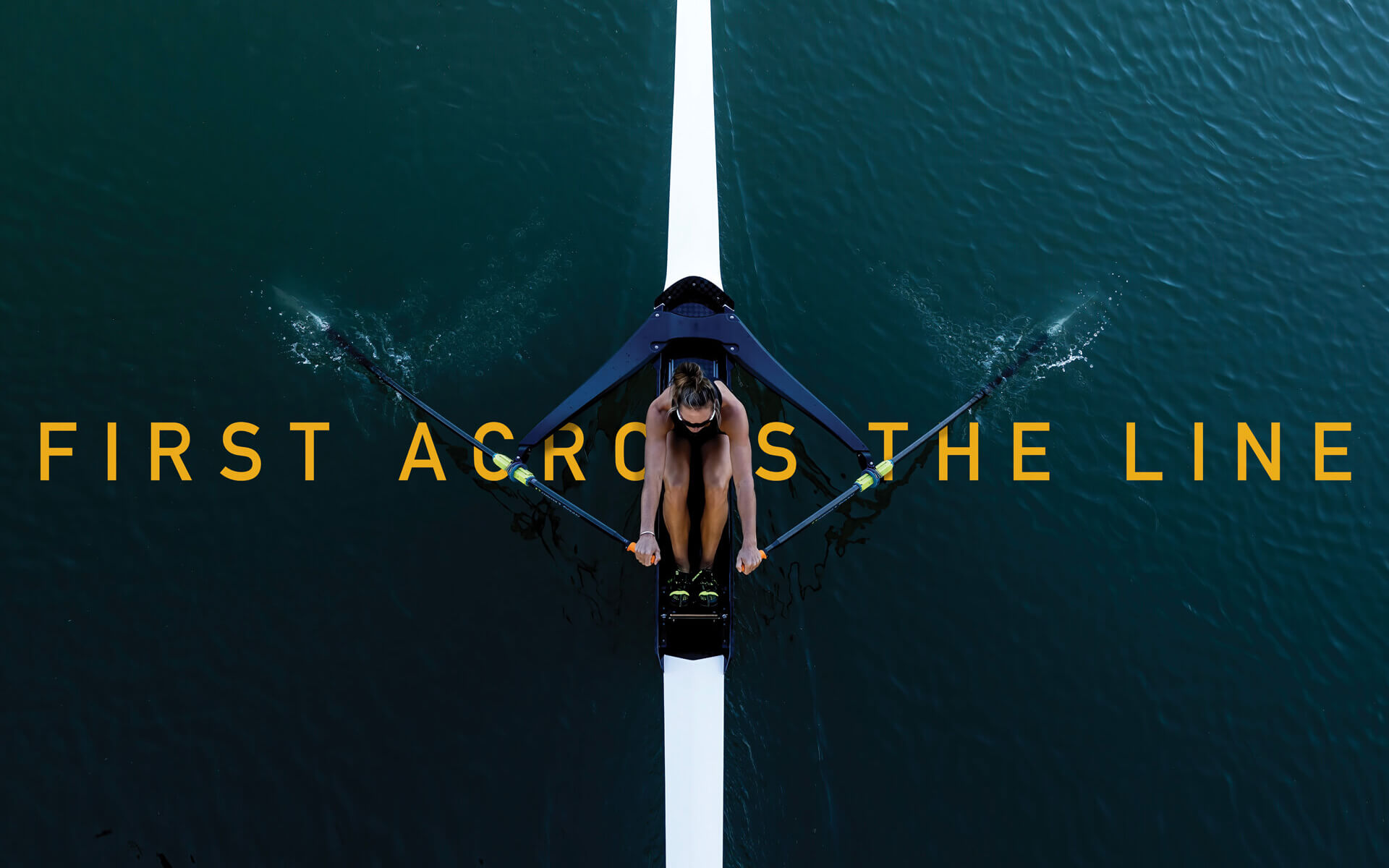
SL Racing required a fresh new face-lift for their brand that would reflect their high quality workmanship and their moto 'First across the line'.
The brand was designed to be clear, sophisticated and to be used for multiple applications including racing shells and boat equipment The symbol represents movement in water and one element extending past the other to be 'first across the line'.
Credit: Project in association with Many Hats


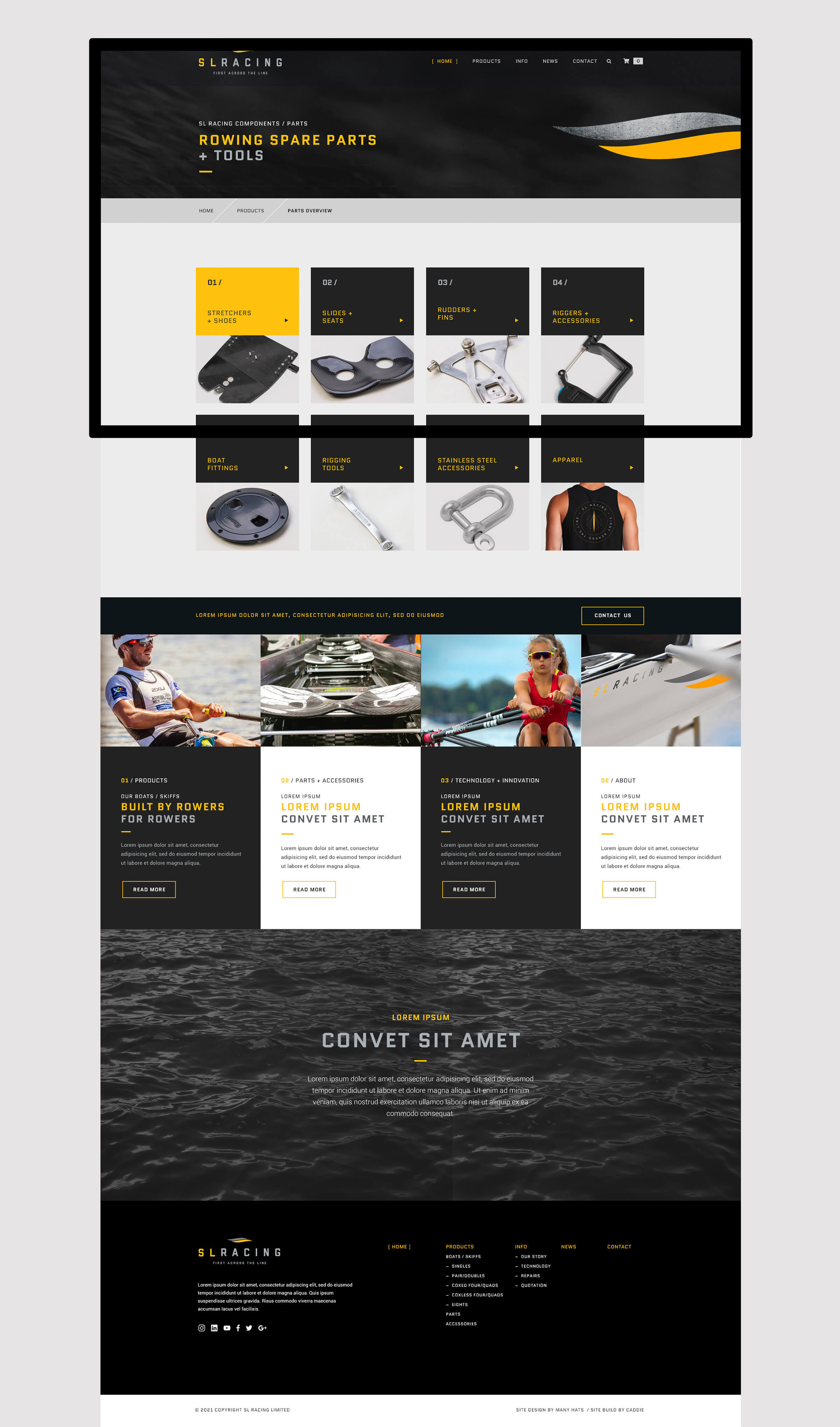


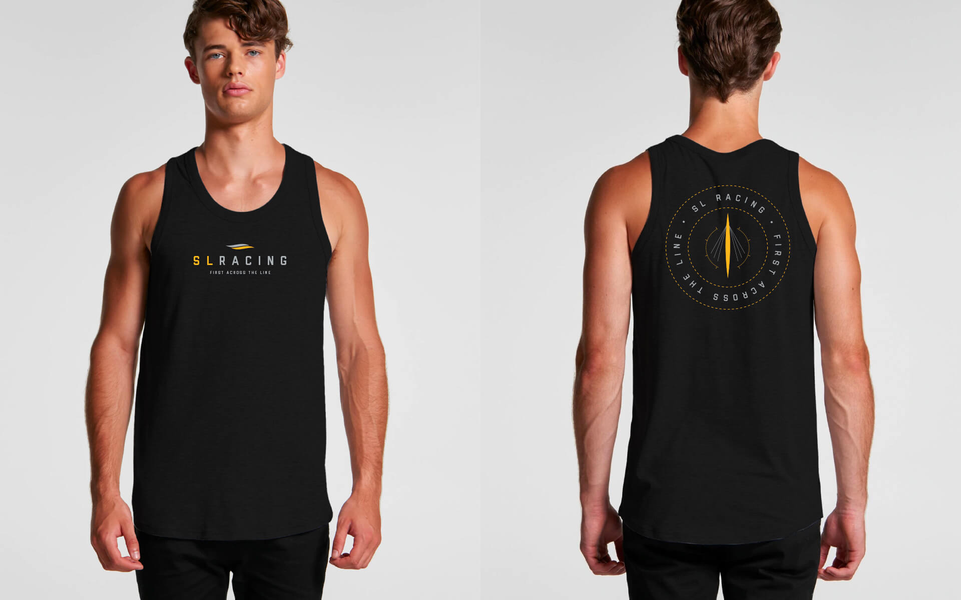
Extras
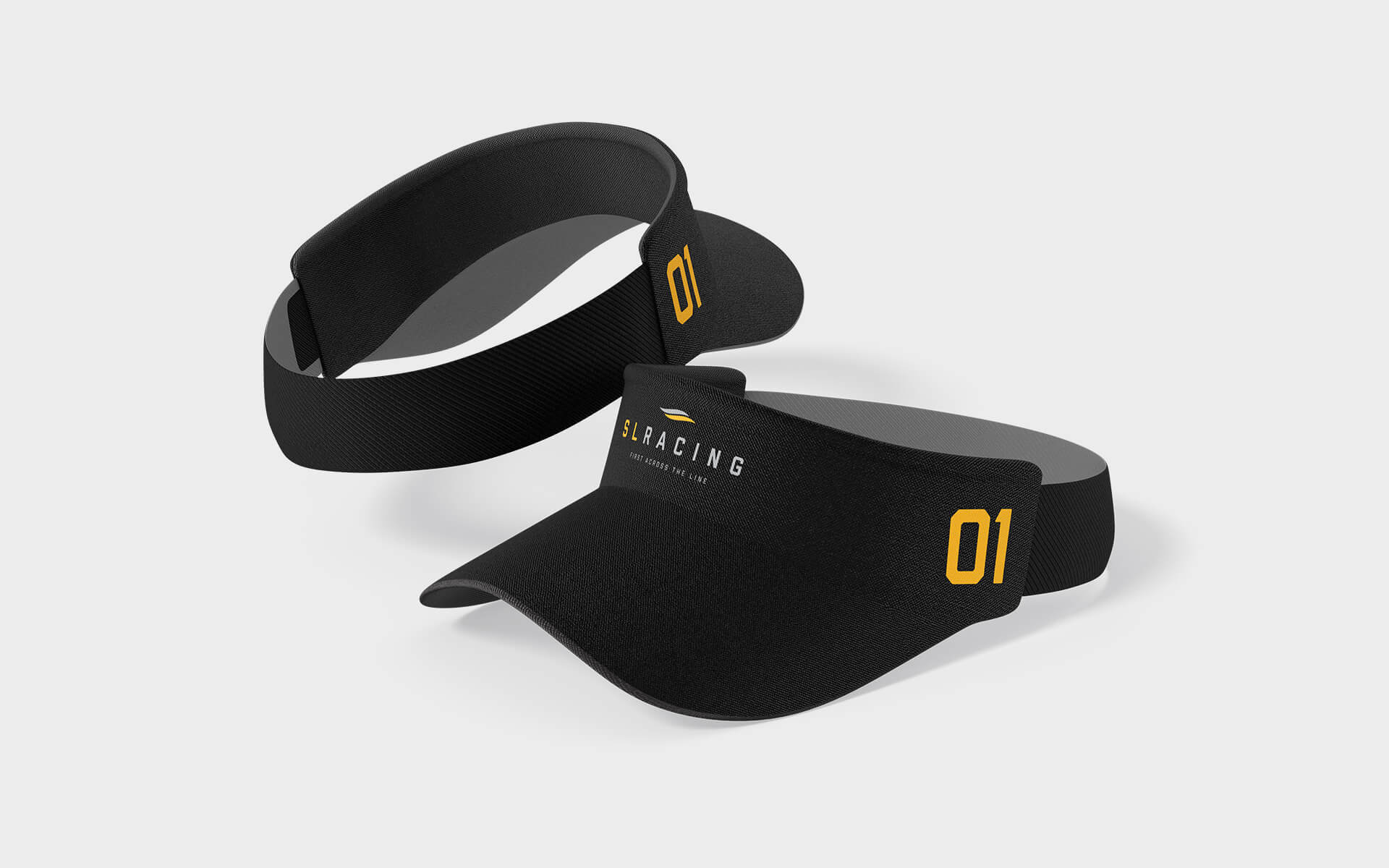
The brand was extended into a icon graphic that could be used as a secondary element to extend the brand into merchansiing opportunities.