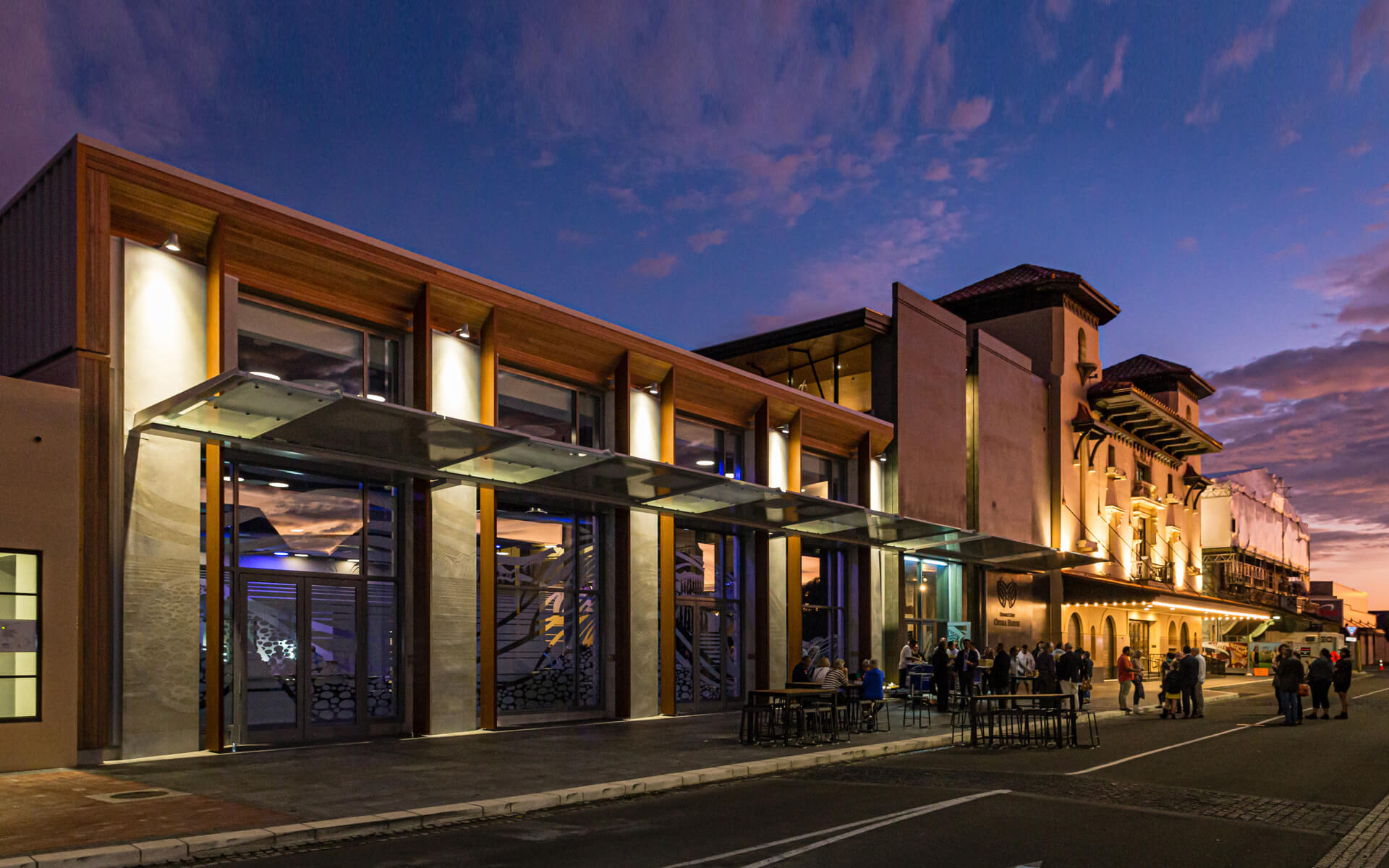
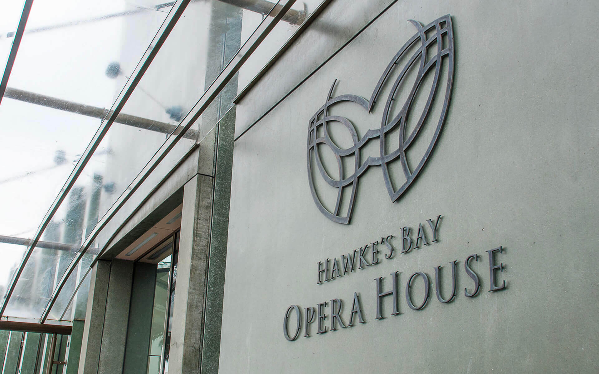
Hawke’s Bay Opera House
Iconic building identity.
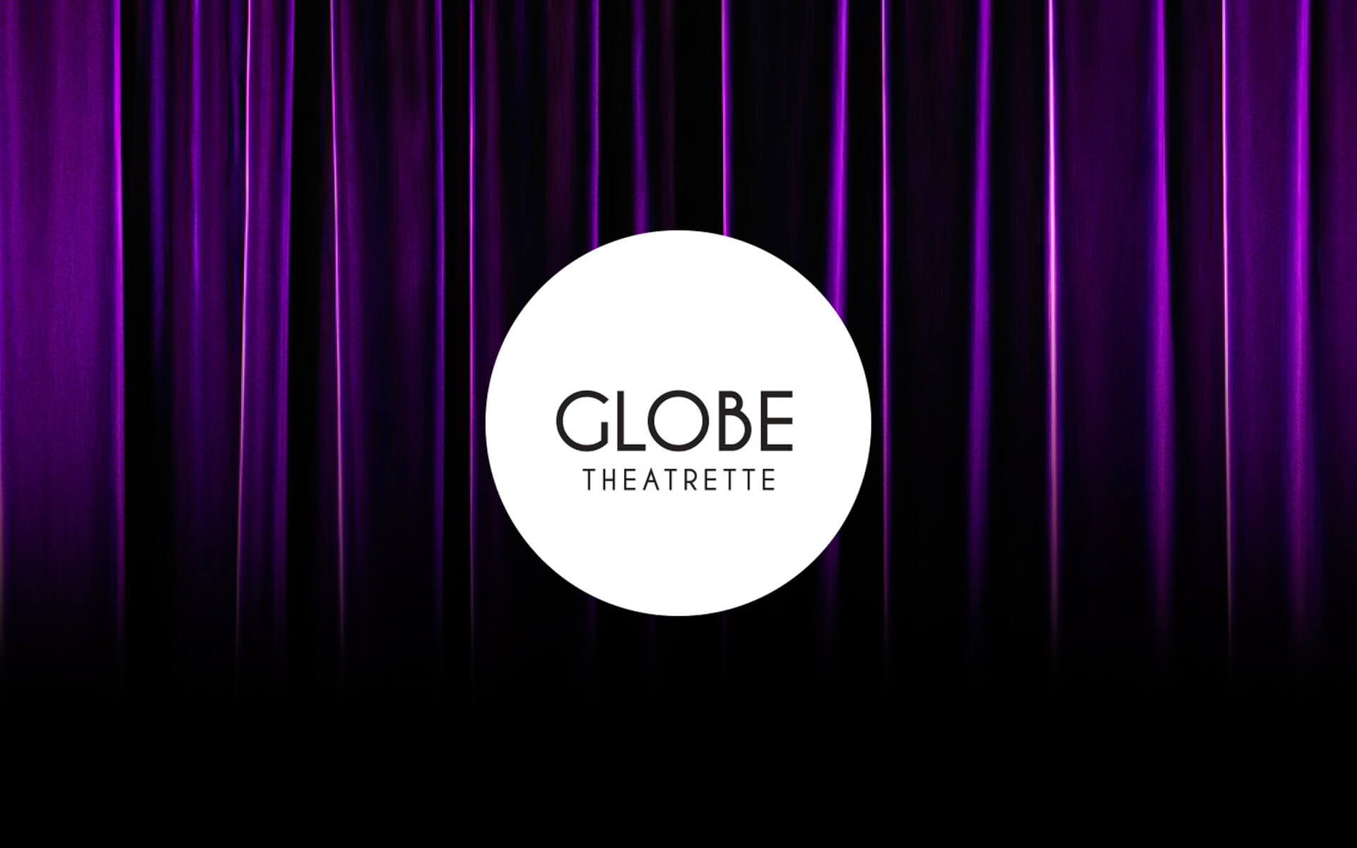
Brand
Logotype + design
The iconic Hawke's Bay Opera House reequired an identity fitting for it's grand and elegant style and which encapsulated the spirit of live theatre experience and it's heritage.
This brand was done back in 2005, so whilst not a new project, it is has stood the test of time and fits in beautifully with the rejuvinated Municipal Building Precinct.
The brand is classic and timeless and the essense of theatre, culture and rejuvination iis captured through the symbol which resembles a theatrical mask, a moko and butterfly.
Credit: Project in association with Cre@ive Design Advertising Ltd and photography by Simon Cartright