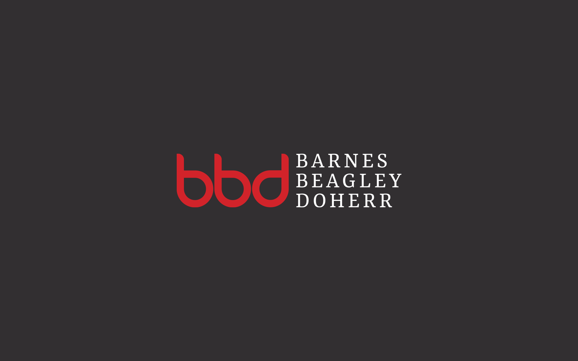
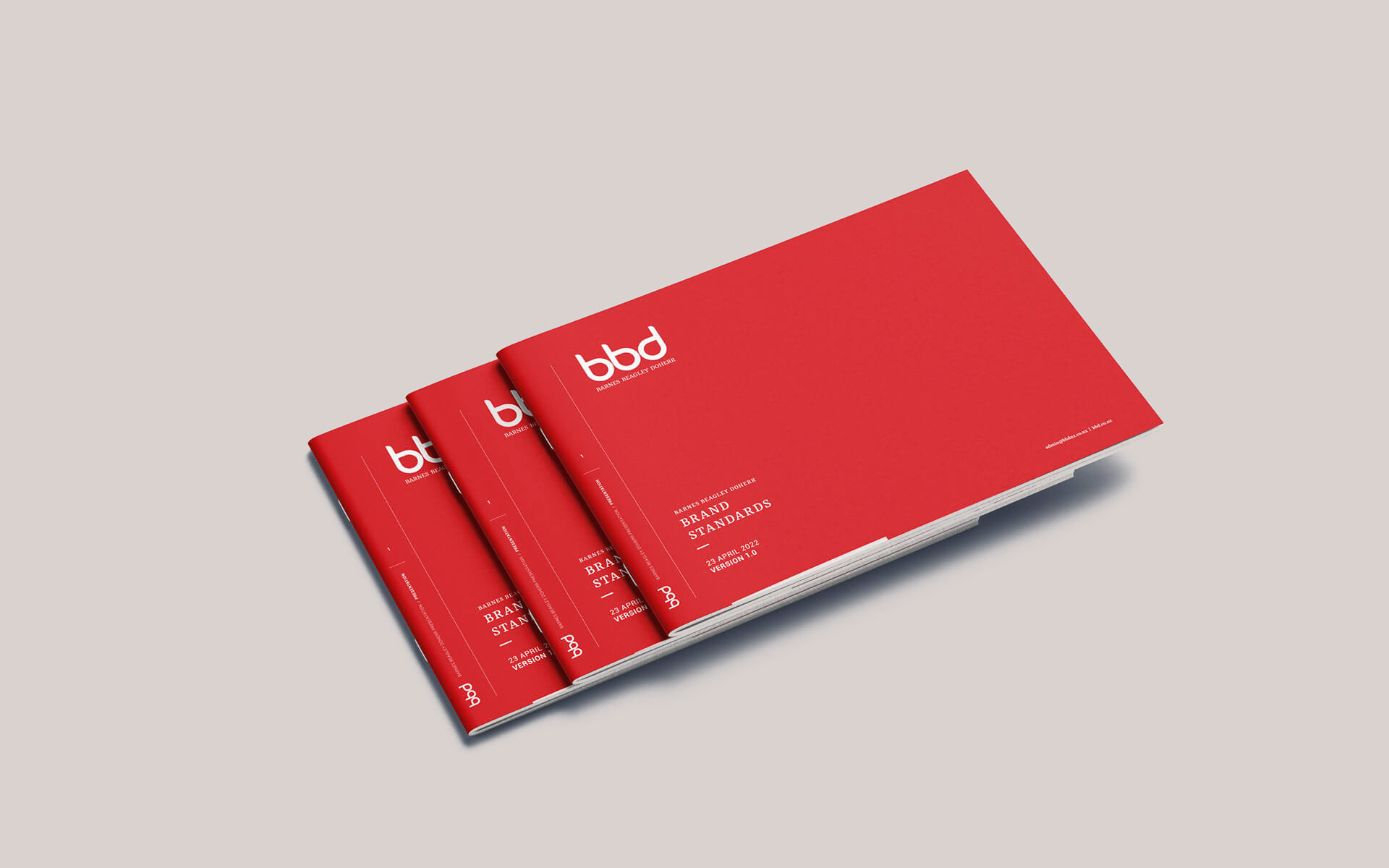
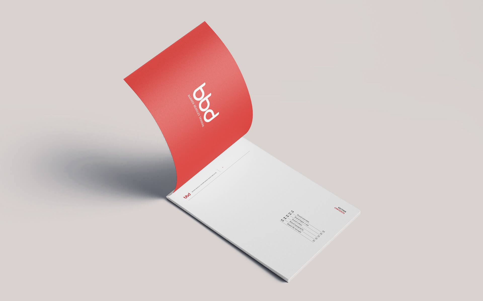
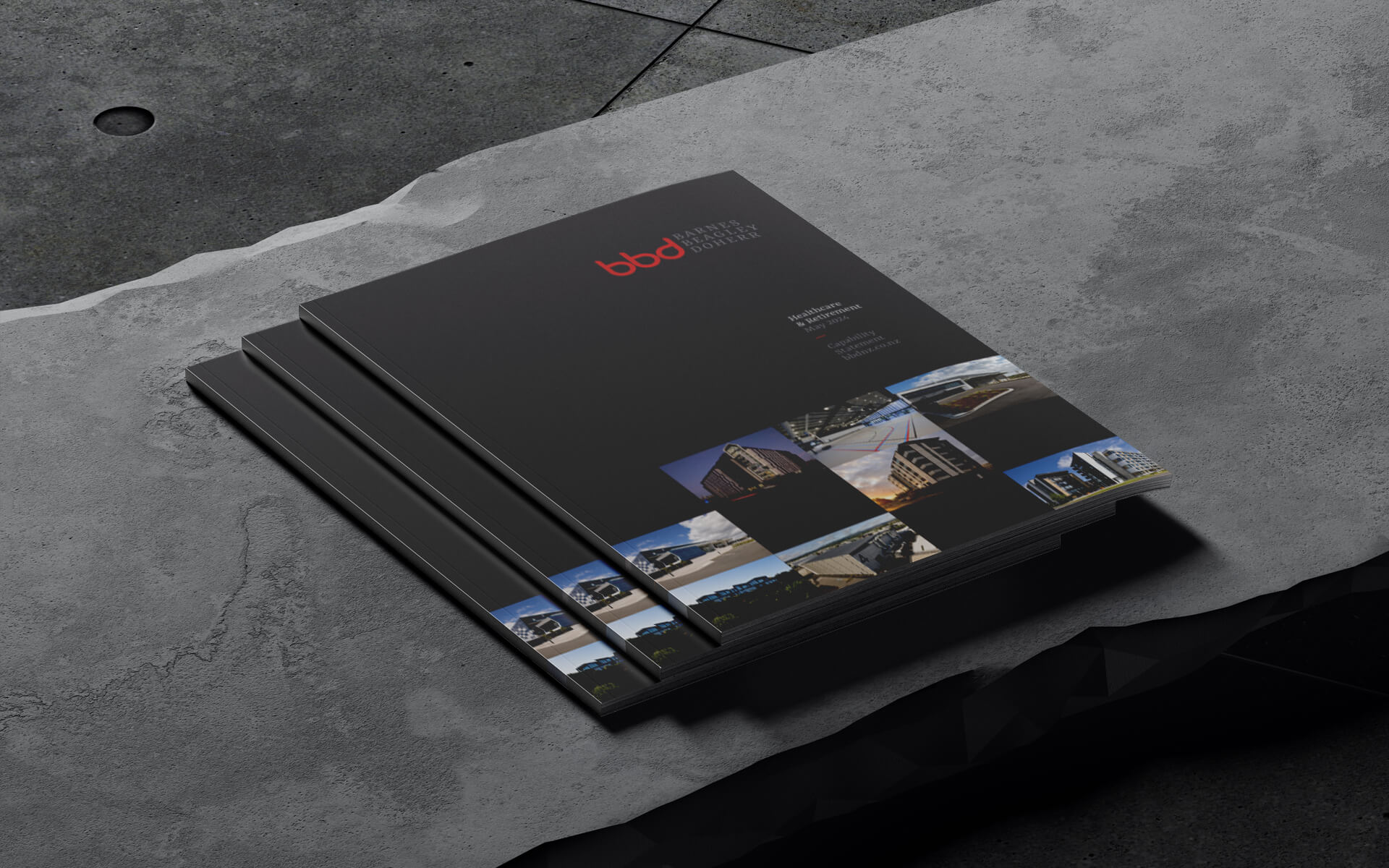
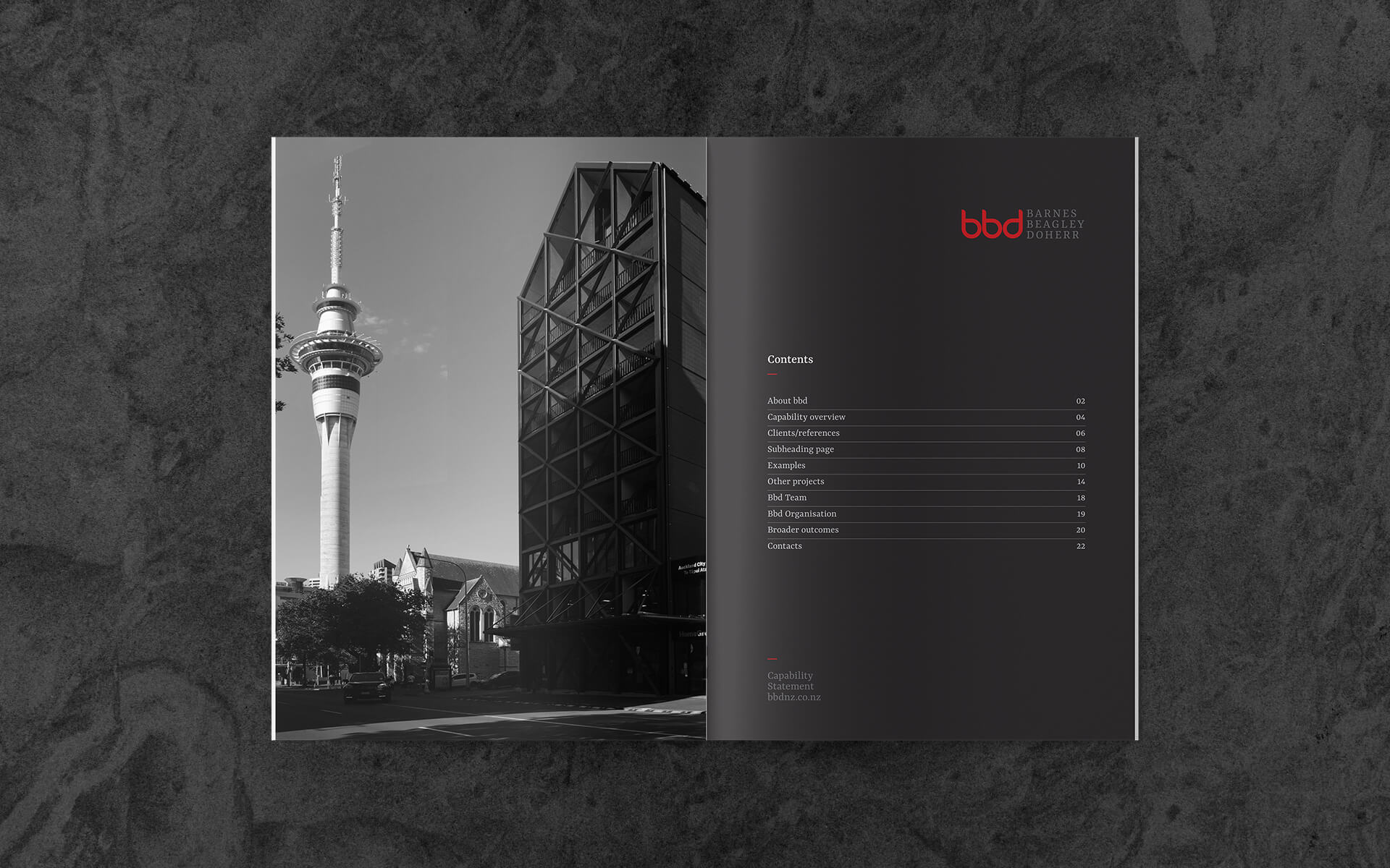
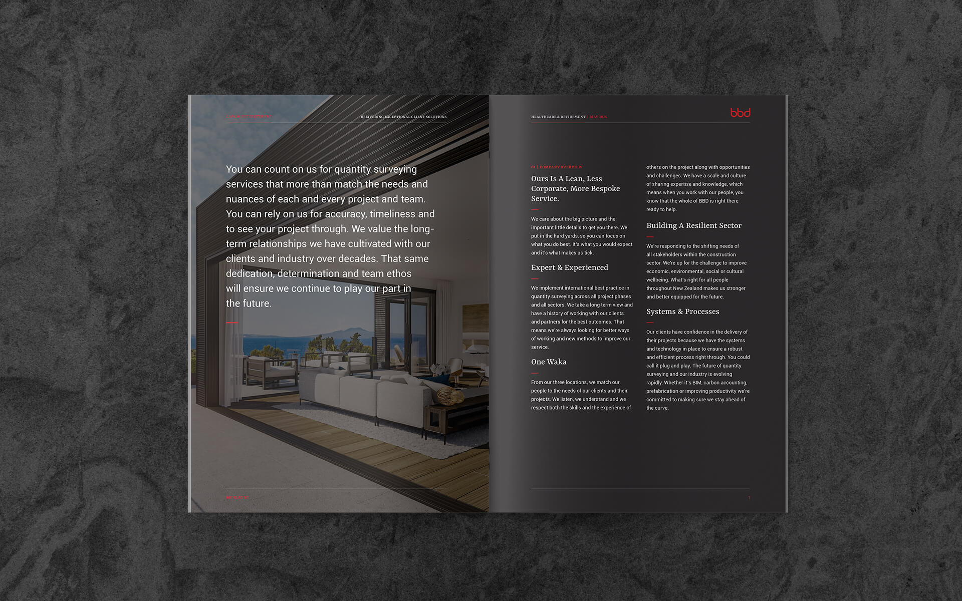
The design brief was to simplify the BBD brand identity, so that it appears to have more mana, more authority, less of the technical ‘under the hood stuff’.
- Art direction
- Brand design
- Presentation visuals
Details
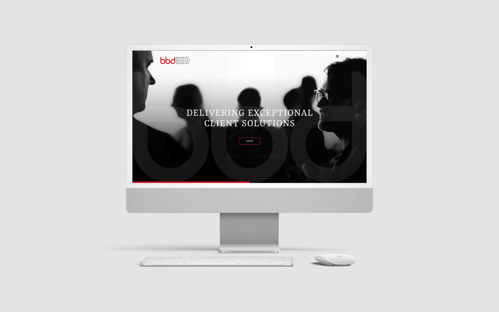
Barnes Beagley Doherr is a company built squarely on it's expertise and the enduring quality of it’s relationships spanning, in some cases three or four decades.
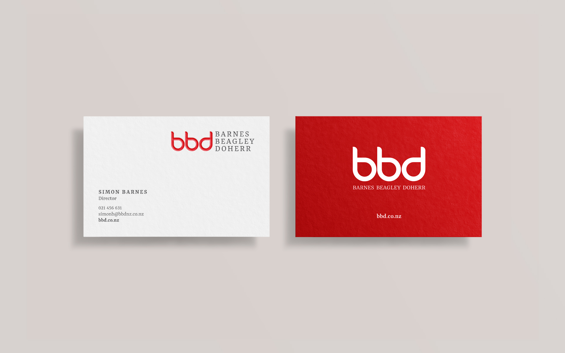
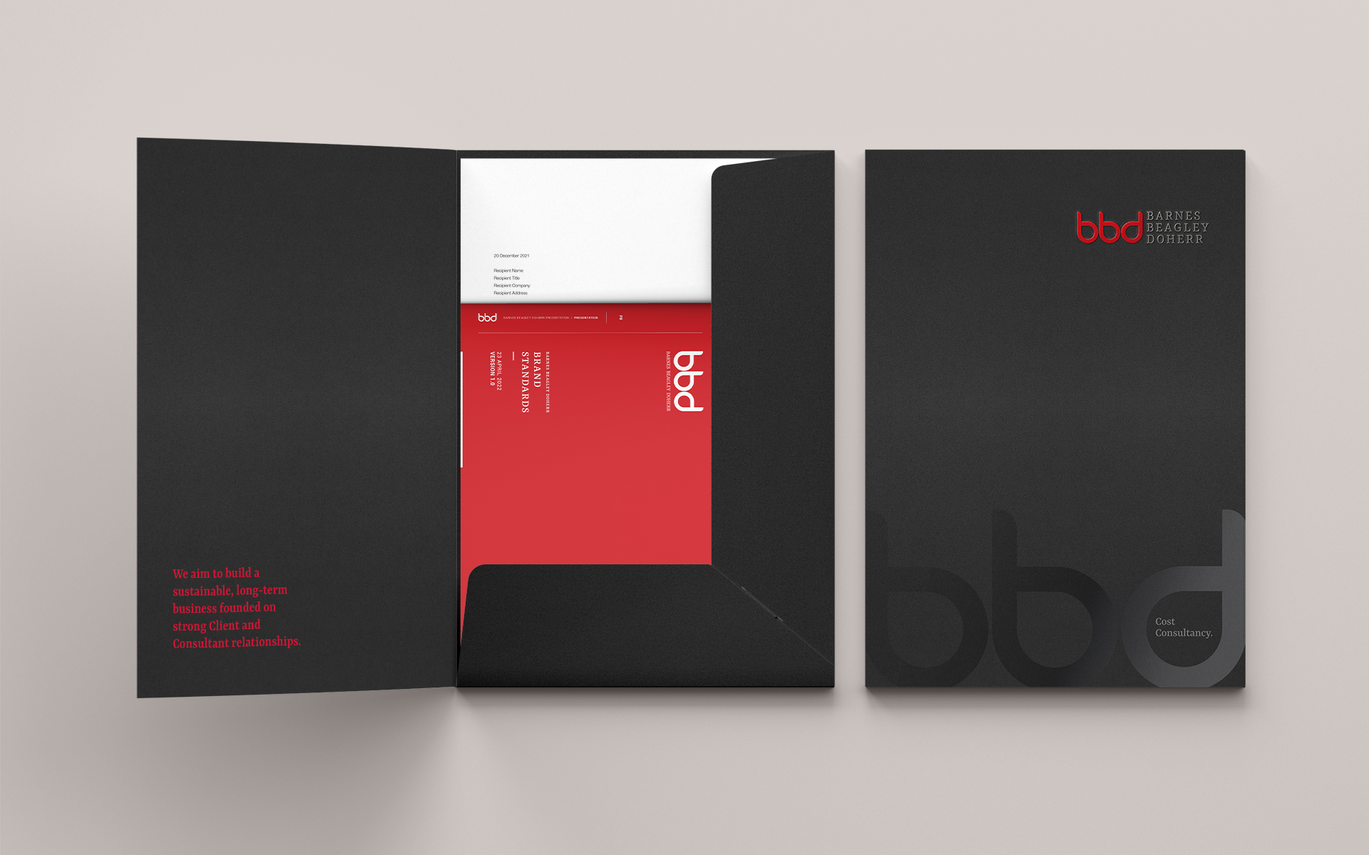
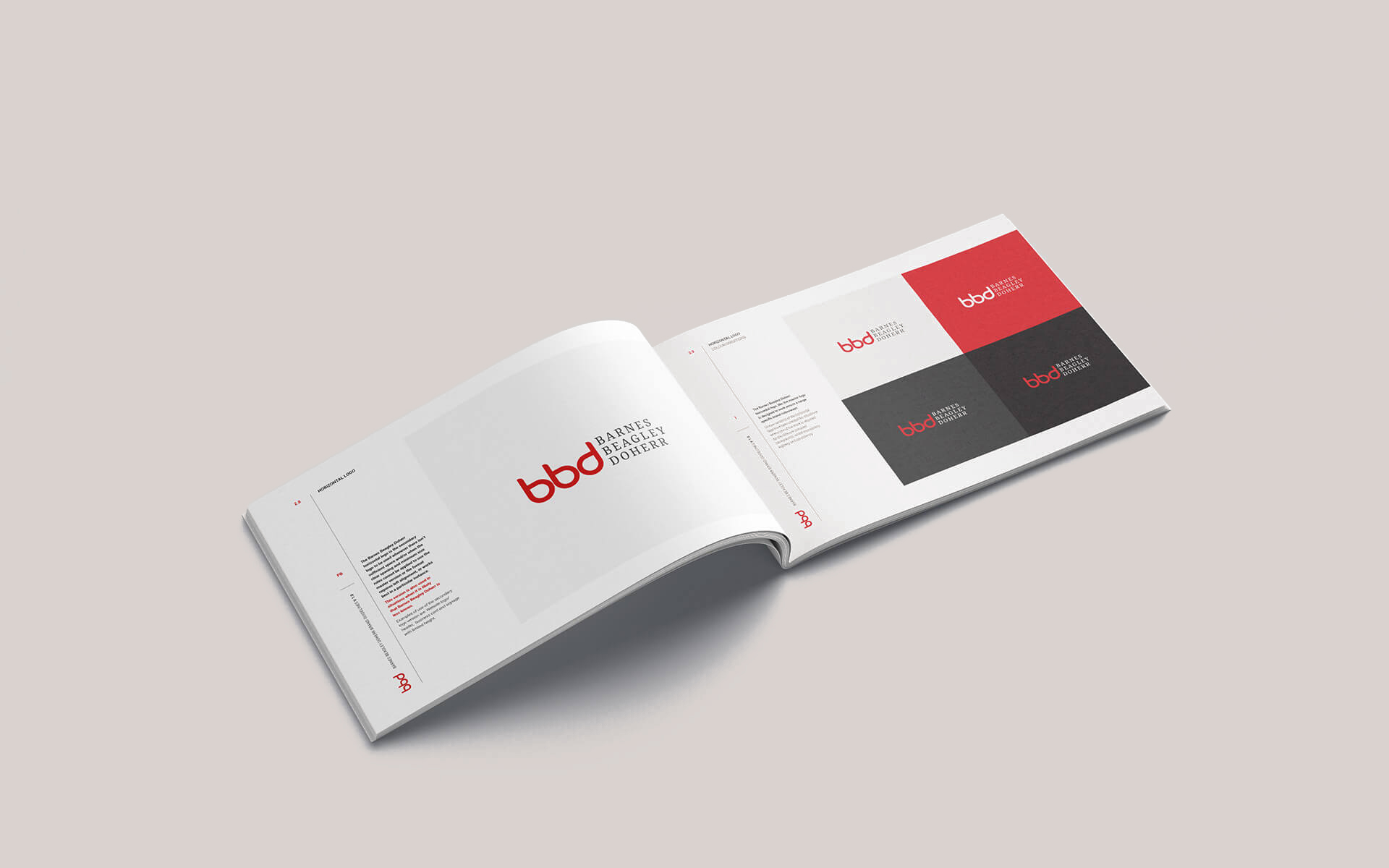
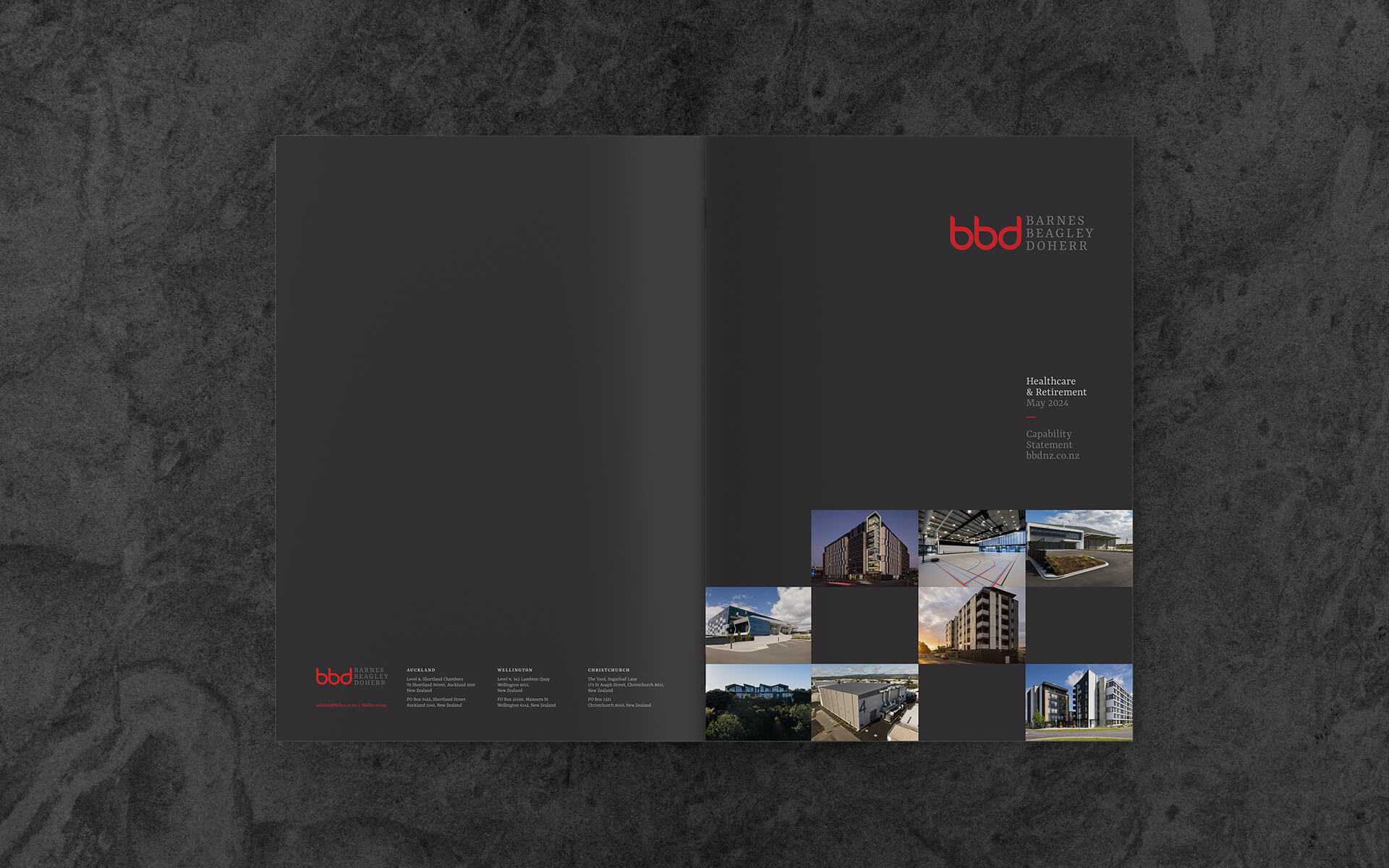
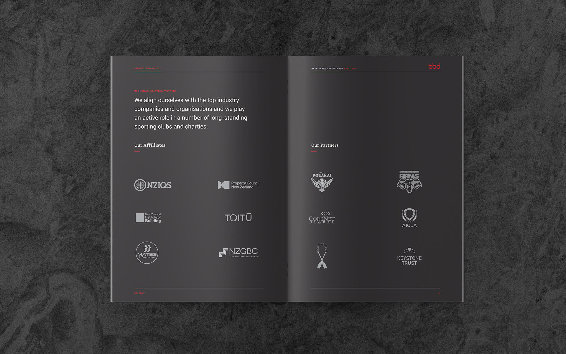
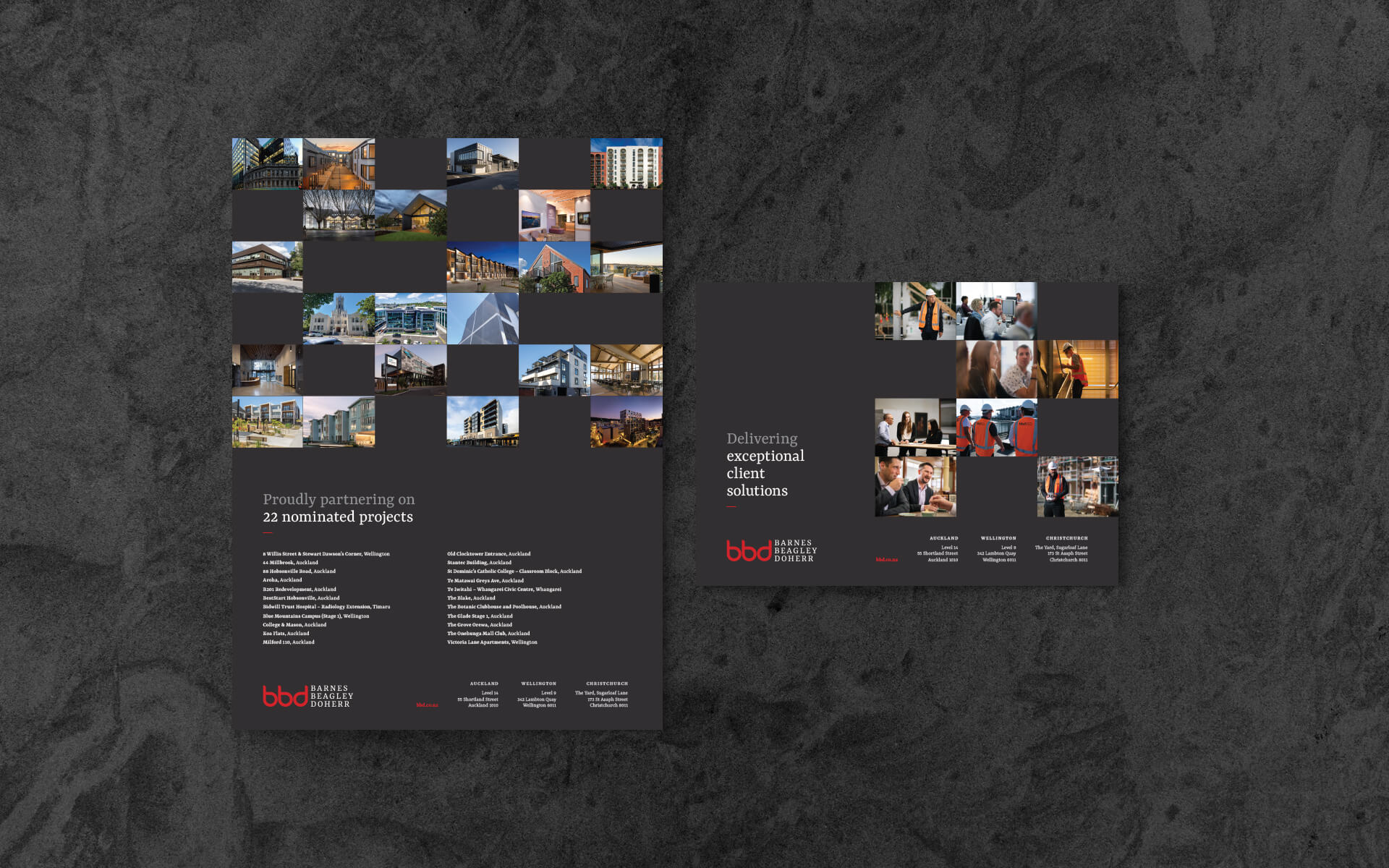
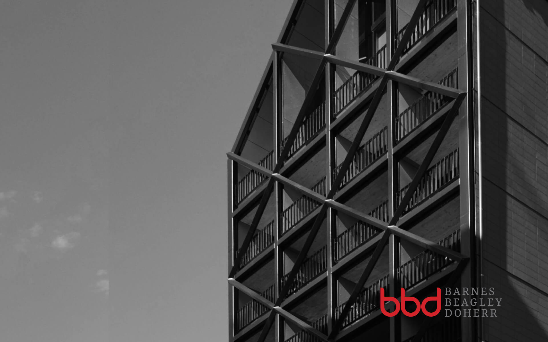
Graphically, it needed to keep things simple and visual. The visual priority was to be on Barnes Beagley Doherr, with the shorthand ‘bbd’, as the secondary element. A warmer serif font was to be considered for Barnes Beagley Doherr and bbd/BBD as a foil to the predominant use of sans-serif in the wordmarks of their competitors.
The brand refresh answers the brief and has a more refined identity whch sits comfortably with the company it represents.