Kate Ivey Fitness
A fresh identity for a dynamic business.
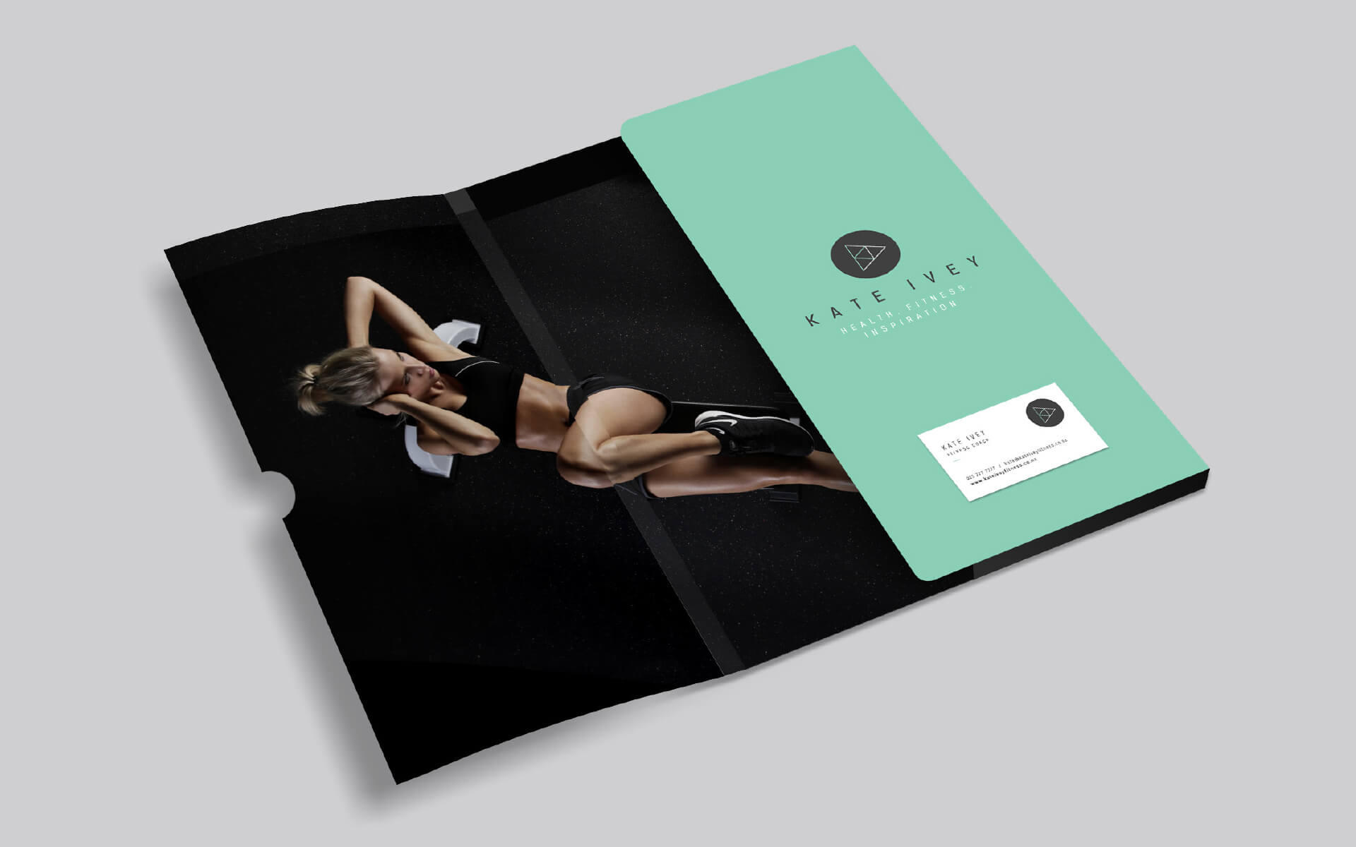
Brand

Logotype + design
Kate Ivey Fitness required a brand that was dynamic and could work well across both merchandise and marketing collateral.
The logo mark incorporates proportion, form, play, inter-connectivity, momentum, strong internal structure and the 3 points of the symbol also represent her tagline, health, fitness and inspiration. The brand collateral is strong and elegant and stands out from the crowd.
Credit: Project in association with 39 Degrees


Website
The website design reflects the fresh look of the brand and clearly lays out the service offerings in an inviting way.